Reading 13 years of Main Roads WA traffic and ABS population data, loaded into a Microsoft Fabric lakehouse and queried to build every chart on this page. What the numbers support, and what they do not.
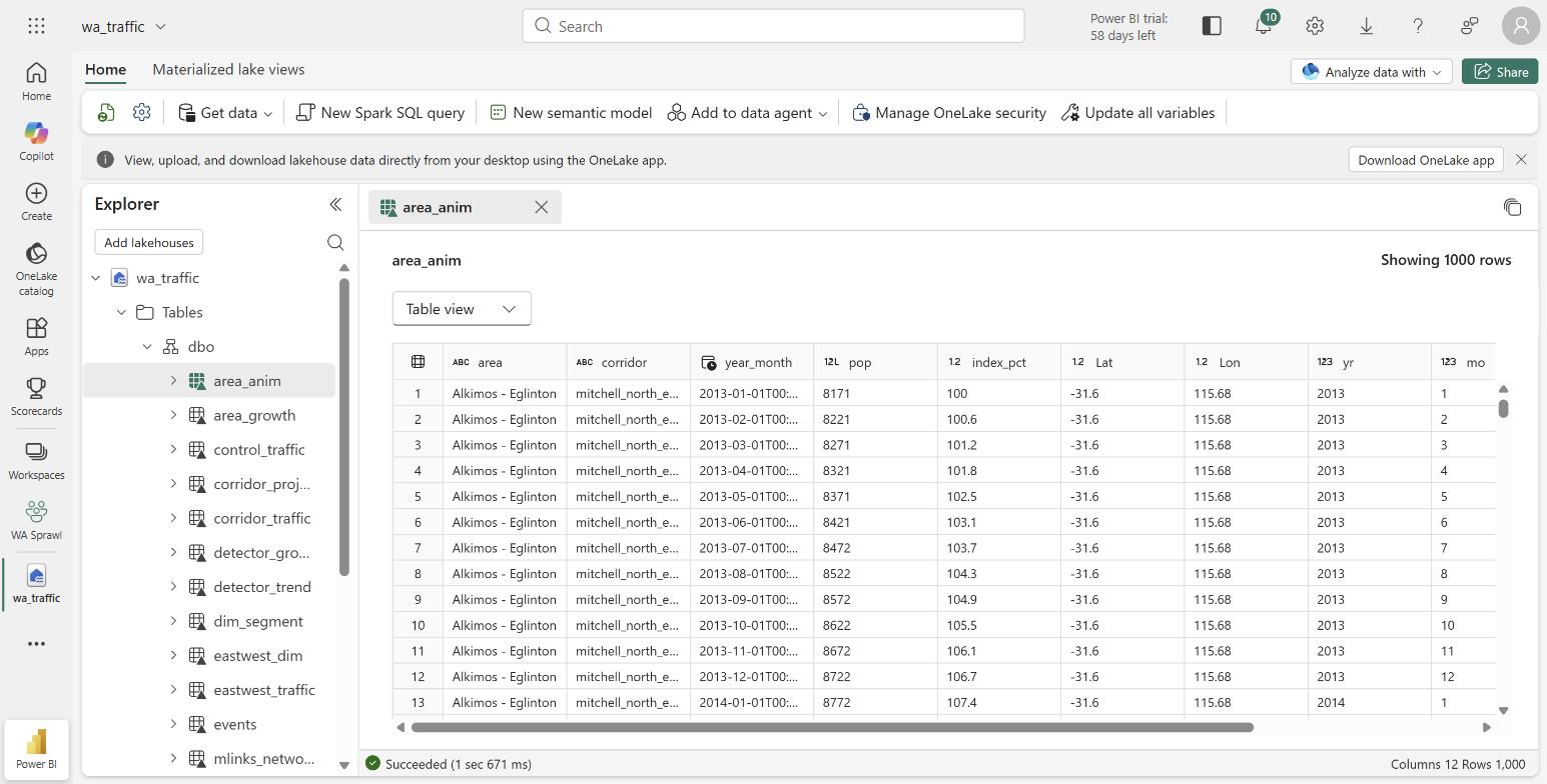
In the Fabric lakehouse. Every dataset loaded as a table in OneLake, browsable in the lakehouse explorer.
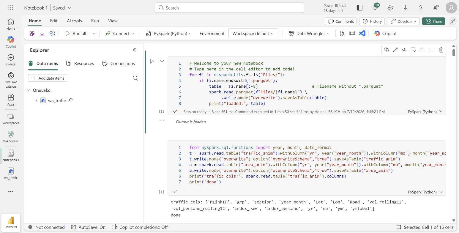
Loading the data with PySpark. A notebook reads each parquet file and writes it as a lakehouse table.
Starting point
The story I expected
ABS suburb figures single out one place, which frames the whole story as a single fringe-suburb boom.
Alkimos-Eglinton grew 13% in one year, the fastest in Greater Perth (2.4%).
The test: did traffic concentrate there too, or spread across the corridor?
Traffic
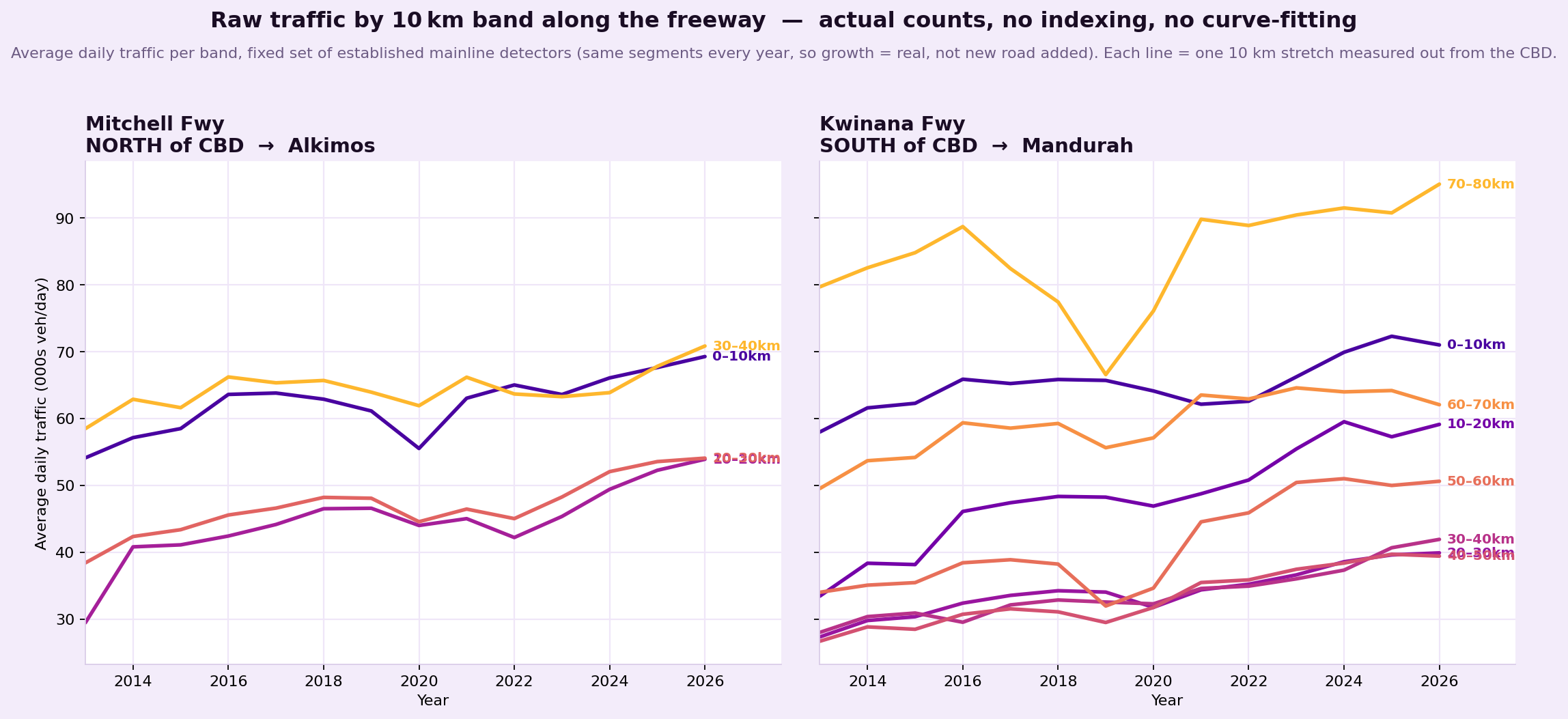
Traffic grew across the whole corridor
Average daily traffic in each 10 km band of freeway, from fixed detectors. Left = Mitchell north of the CBD to Alkimos, right = Kwinana south to Mandurah.
Raw average daily traffic, fixed detectors. No indexing, no curve fitting.
Population
Growth by council: people vs rate
Bar length is people added, colour is the growth rate. Wanneroo added the most people. Kwinana grew fastest, from a smaller base.
People added 2020 to 2025 (colour = growth rate)
Growth rate:lowhigh
Traffic · capacity
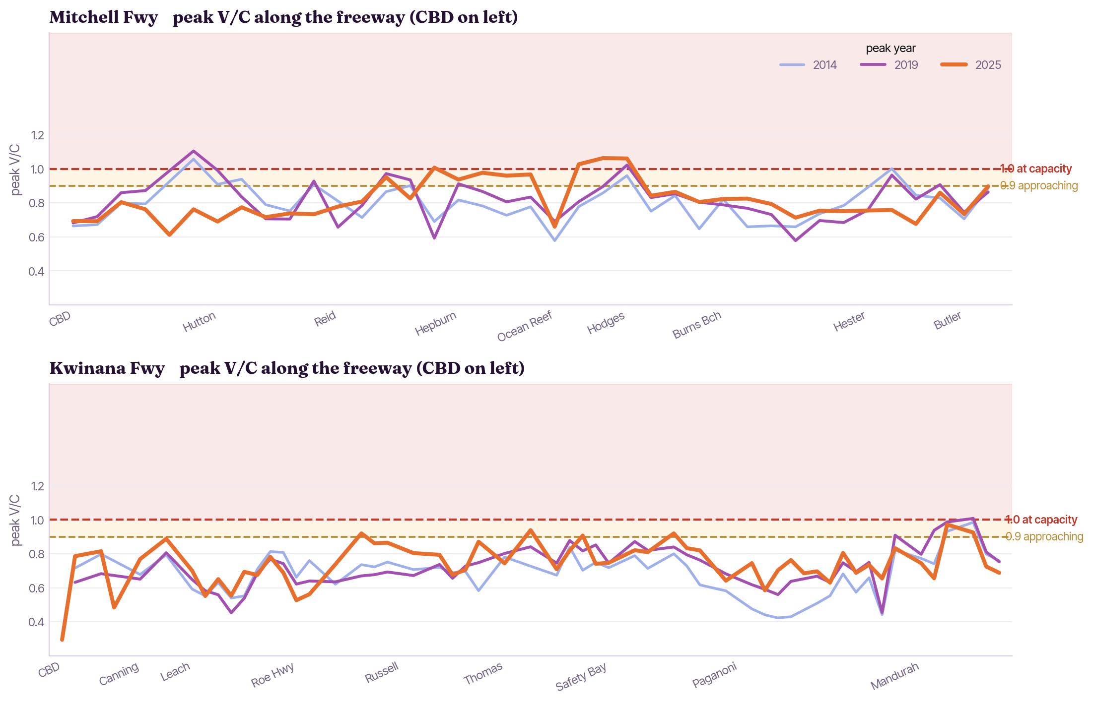
Where the freeway hits capacity
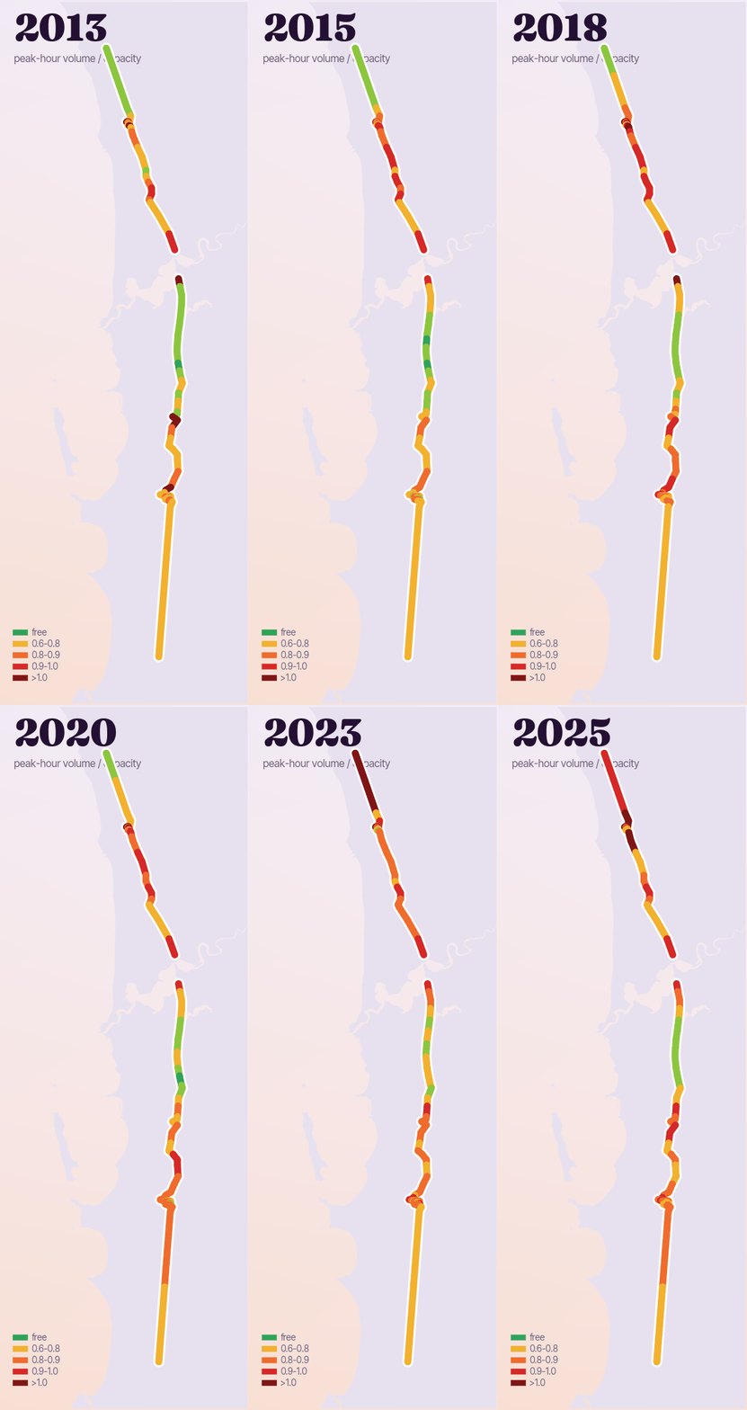
Peak-hour volume to capacity along each freeway, CBD on the left. 0.9 is approaching capacity, 1.0 is at capacity.
Traffic · capacity
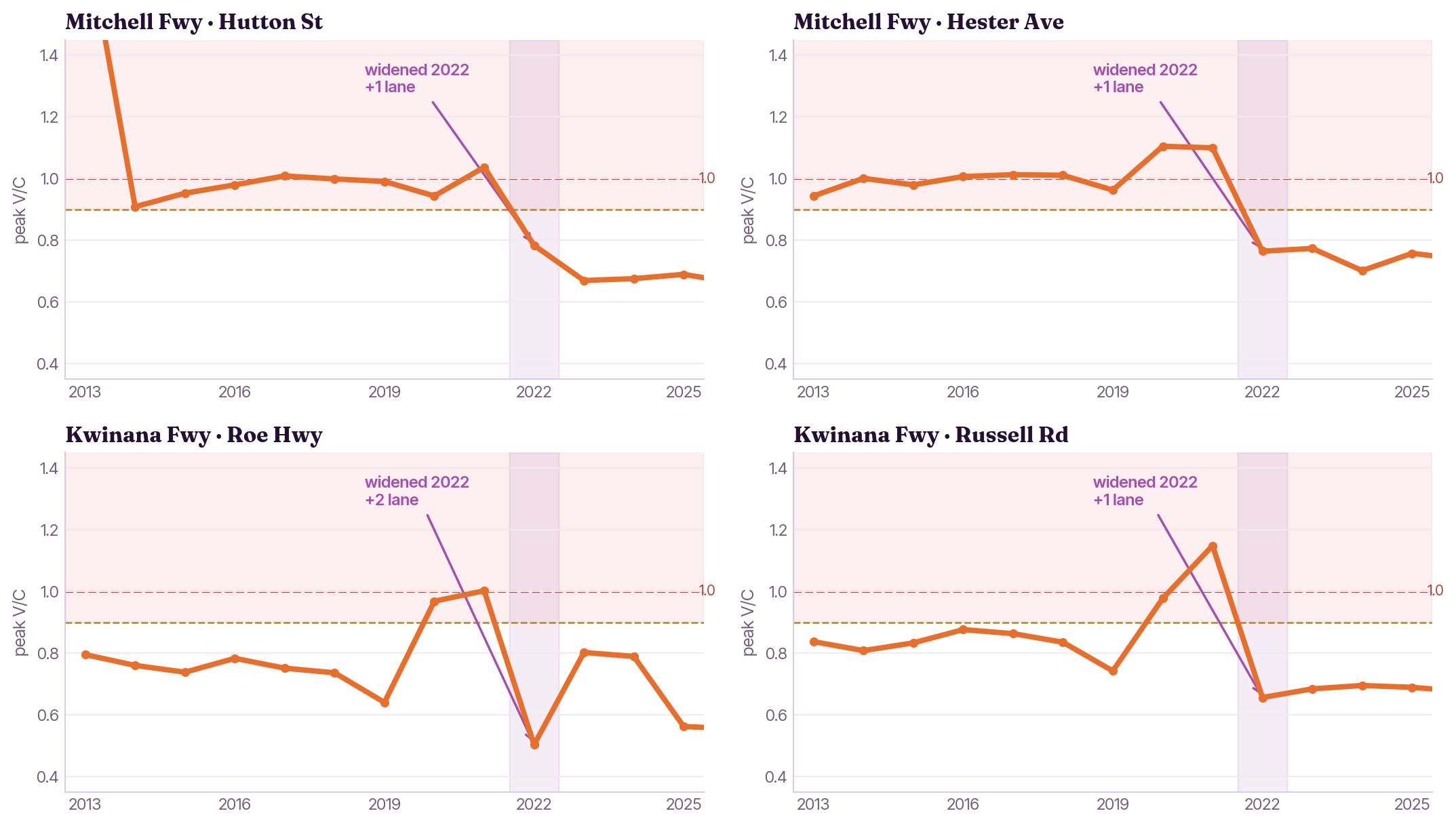
The dips are real widenings
Peak V/C climbs to capacity, then drops the exact year lanes were added (purple). The dips are real capacity, not noise.
Roe Hwy then refills within a year: new capacity filling back up, the induced-demand signature. Interchange labels approximate from chainage.
Population
Population growth, concentrated
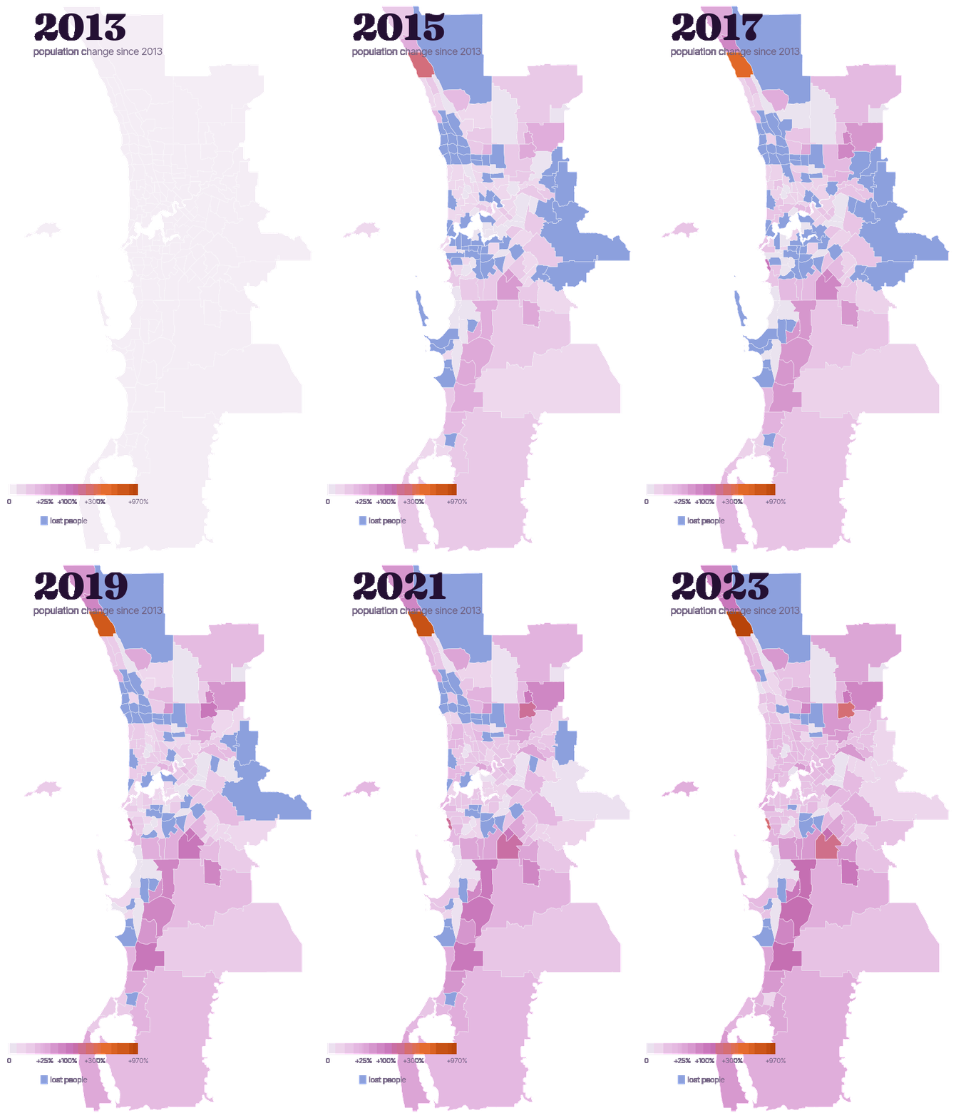
Growth since 2013 by suburb. A ring of outer suburbs, not the whole city.
Selected suburbs, 2013 → 2023
Suburb
Population
Change
Alkimos-Eglinton
1,655 → 17,706
+970%
Brabham-Henley Brook
4,201 → 14,337
+241%
Piara Waters
6,370 → 19,325
+203%
Baldivis North
5,993 → 14,158
+136%
Willetton
18,690 → 20,701
+11%
Ballajura
20,408 → 19,463
−5%
→ A ring of outer suburbs, not the whole city.
Map colour = growth since 2013; blue = lost people.
Traffic
The freeway fills up
Each stretch is coloured by volume-to-capacity at peak hour, like a live traffic map: green is free-flowing, red is at or over capacity. Year on year the whole corridor reddens, north and south, worst near the CBD and the Narrows.
→ Congestion spreads along the whole corridor.
Volume/capacity = peak-hour flow ÷ lane capacity.
Travel behaviour · PATH survey
How Perth travels, with caveats
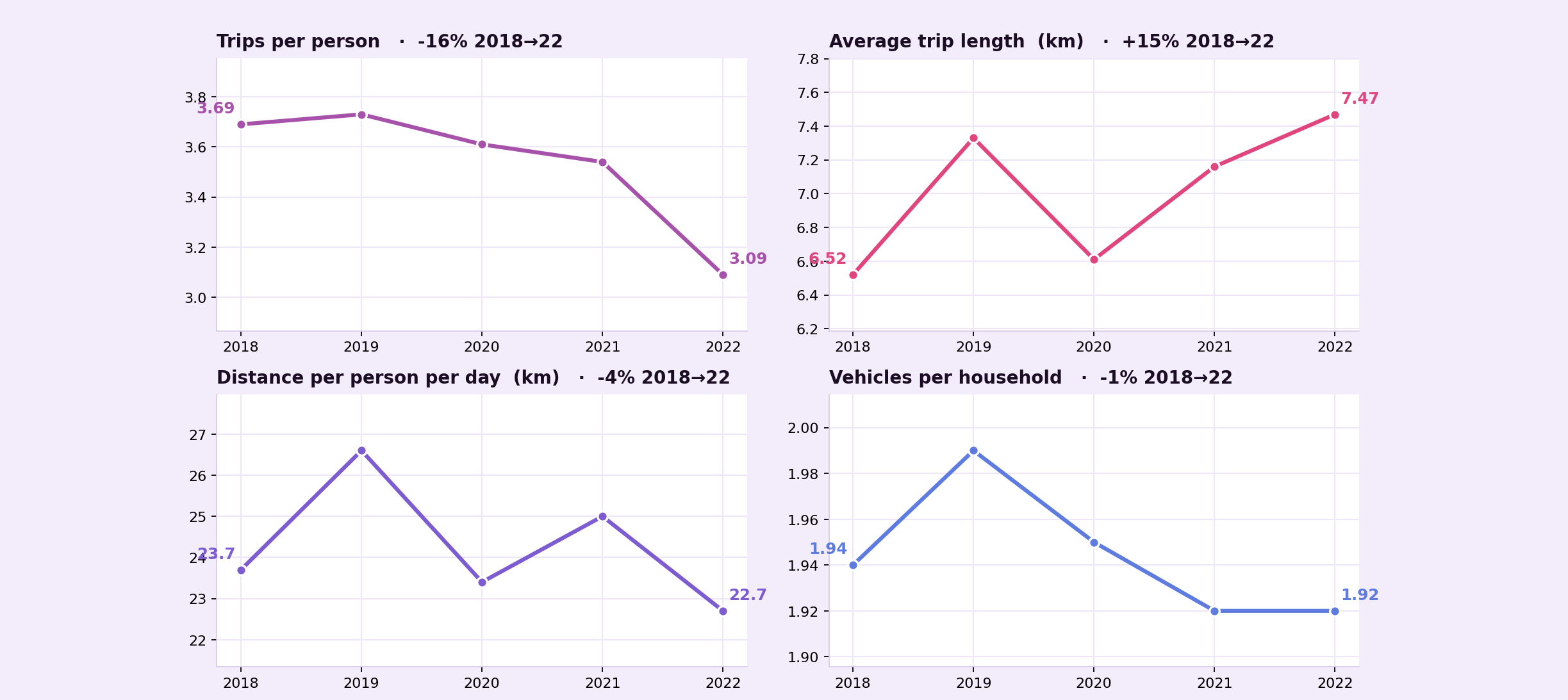
Household travel survey, 2018 to 2022: trips per person fell 16% while the average trip got 15% longer.
Survey estimates, not a census: small samples (about 2,000 to 4,300 people a year), 2020 field work was disrupted by COVID, and the series ends before the 2023 freeway extension. Indicative, not proof.
The point
What the data can, and cannot, say
Method. Raw counts only. No smoothing, no indexing.
Finding. Population growth is concentrated; traffic growth is corridor wide.
Restraint. Where the data ran out, I stopped short of the claim.
Data sources
Datasets and sources
Dataset
What it covers
Source
Traffic volumes
Main Roads WA loop detector 15 minute records, 2013 to 2026.
 Main Roads WA
 ABS
ABS Travel survey
 CSV / XLSX
 Parquet
 Fabric lakehouse
 SQL query
 Charts